

Spark Creativy
Book Covers As A Mode Of Authorial Communication: An Analysis Of The Principles Of Design With Reference To Select Novels
Abstract:-
A book cover is a form of visual storytelling. However, if it is said to not judge a book
by its cover, then why design a book cover at all if it isn't judged? A book cover communicates
what the author wants to communicate to the reader visually. Out of many Principles of design,
the Principle of Hierarchy, Color harmony, and Unity are analyzed in this research. This study
focuses on the application of the Principles of Design to book covers of selectively realistic
fiction and fantasy fiction novels. It elaborates on the essence of each principle with examples
and underlines how each of them stimulates the reader’s mind through the book's covers
concerning its genre. This also illustrates how the author uses the book cover as a mode of
communication with the audience with respect to principles of design. Therefore, this research
enables us to judge why a book cover is designed the way it is.
Key words: Communication, principles of design, book covers.
Principles of design play that role in any art, just as grammar plays in the English language. Principles of design are the fundamental rules to be followed by artists, designers, or creators to create an attractive and effective composition of art. A book cover is the face of the entire content inside a book and translates into the author's mode of communication. Therefore, the designer invests enough energy, ideas, and knowledge to enhance the communication of the author through the book's face. The use of principles of design enables the designer to convey the message efficiently that it intends. Most of the principles have overlapping features that work together toward one goal. There are uncountable principles of design from which, selectively, hierarchy, color harmony, and unity principles are analyzed on selective book covers with illustrations. Hence, to dive into the analysis, it is important to understand what hierarchy, color harmony, and unity principles mean.
Hierarchy and Emphasis:
Studying optical illusions in art has a significant and extensive historical foundation. The lasting impact of ancient Greek and Roman artists is particularly remarkable, as they employed techniques such as trompe l'oeil and perspective to achieve an illusionary sense of space in their paintings. These techniques, employing forced perspective to deceive the viewer's perception by making painted things appear genuine and creating the illusion of three-dimensional effects on a flat surface, still inspire contemporary artists. The use of chariosurio techniques, shading, and perspectives in Trompe l'Oeil paintings to give a sense of dimension and realism is a testament to their lasting impact. These classical techniques are traced back to the European Baroque and Rococo periods and were widely used to implement ornamental murals and decorations. (Meyer, 2023) In the modern trends, trompe l'oeil art is prevalent and can be found in many forms, including murals, graffiti, street art and architectural ornamentation.
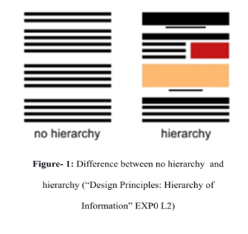
Hierarchy and emphasis go hand in hand. It is a visual journey that makes one element stand out more than another. The most important elements on the book cover are designed to be more prominent and progressively less prominent in their size, color, or position on the book cover. “[H]ierarchy refers to a group of elements that are organized in order of importance” (“Understanding Visual Design Principles: Google UX Design CertifCertificate 04:50–4:54).In figure. 1, the hierarchy's image states no distinction within the lines and displays an ordinary view. Whereas, in the image stating 'hierarchy',’ the content is placed with the first attention to the skin-colored rectangle in the center, supported by a short black underline. Then the attention moves to the top black rectangle and glides to the next few lines with the red box and the last four black lines at the end
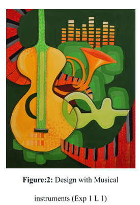
As per the painting (see figure 2), the yellow guitar seeks first attention as it has an emphasis in proportion to other shapes, and the horizontal green guitar shape follows the view. From the red piano tiles flowing from the top left, the eyes glide to the trumpet, the music bars, and the remaining elements towards the end. Thus, the principle of hierarchy is determined by the artist by placing the most important elements or objects first. The variability in size, shape, placement, and color distinguishes the positioning of ideas in a hierarchy.
Colour Harmony:
According to Kjell Regstad, “individual colors say a lot on their own; most of what we see in the world involves more than one color. The way those colors work together is called color harmony” (EXP0 L3). Color plays a role in adding life to any art. Each color has its own psychological appeal and mood that can vary as per personal response. The use of specific color combinations triggers a certain mood. “Color is classified and organized what is known as color wheel” (Black 14). In Figure 3, the color wheel is organized into primary, secondary, and tertiary colors. Additionally, when the color wheel is divided into exact halves, it states the warm and cool colors, called the Warm and Cool color scheme. Figure 4 signifies the same.
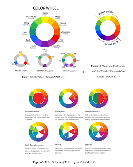
Figure 5 explains each of its color schemes, where any one of the schemes is used by the designers to create art. However, the interpretation of color can vary from individual to individual. As every color has a meaning or emotion, content-based color schemes glorify the communication’s clarity. It also strengthens the visual understanding of what art intends to say or do. A combination of colors in a specific manner from the classified color wheel is called a color scheme. “A color scheme is used to describe the overall selection of colors in an artwork. The major color schemes in the art are analogous, complementary, split-complementary, triadic, rectangular and monochromatic” (Scott Exp 9 L 10). The above figure 5. explains each of its color schemes; any one of the schemes is used by the designers to create one piece of art. Additionally, when the color wheel is divided into exactly half, it states the warm and cool colors, called the warm and cool color scheme. Figure 6 signifies the same. Along with the schemes, color hue, saturation, and value are considered. Hue is the specific color to be used, saturation is the intensity of the color (from too bright to too dull), and the value refers to how dark (shade) or light (tint) the color is. Shades (hue+black) and tints (hue+ white) determine the color value.
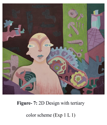
Concerning the abstract painting figure- 7, the
colors used are tertiary colors from the color
wheel and the split complementary color
scheme. consisting of green, yellow, and
magenta is used. With minimum use of hues
and low saturation, the color values include
tints and shades. The overall art provides a
pleasant appearance and thoughtful mood for
viewers to understand the objects and the man
placed in the painting. Therefore, the use of
color schemes triggers the right point of the
viewer and attains the mood the color intends.
“Human emotion can detect the effects of cool or
warm colors, evoking a sense of cool, tranquil relief
with blues and greens or the excitement of red and orange. Color has a long association with symbolism and affects us psychologically, e.g., ‘seeing red’ as associated with anger, being
‘green’ with envy, or perhaps feeling a little ‘blue’” ( Black 25).
However, the interpretation of color can vary from individual to individual; what carries it is the
other elements used around the color, e.g., on a red background, a flower can denote love, and
unlikely, a cross symbol will denote danger. As every color has a meaning or emotion,
content-based color schemes glorify the communication’s clarity. It also strengthens the visual
understanding of what art intends to do
Unity and Harmony:
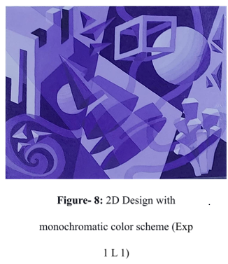
The principle of Unity is the base of all other design principles and elements and conjoins them in one piece of art. “Utility is what gives a design the appearance of cohesiveness despite its internal components differing in scale, contrast, or style” (Silveira EXP20 L8). Unity, as the word states togetherness, combining multiple shapes, forms, texts, and colors and including in one piece of art with balance, provides clarity of content. Unity can be maintained through multiple factors, such as repetition of the elements, alignment- (simultaneously placing the elements) , proximity- (placing things together or grouping), color (using color schemes, etc.). The monochrome color scheme with the tints and shades of violet combines the forms and motifs of different characteristics into one; see fig. 8. Alone the same, The cubic forms on the top left corner balances the bottom right form. The flowing curvy line conjuncts the other shapes either by overlapping or passing through it, acting as a connection. Following the appropriate color scheme, the composition of elements of art grants a path to achieve harmony in overall artistic creation.
Consciously or subconsciously a book cover creates an image in advance before knowing what's inside. The book cover bridges the gap between the world of a book and the outer audience before entering the universe that the author creates. Therefore, the verbal text of the book is conveyed visually through the book’s face. According to a UX designer, Dan Silveira, “the principles of design help us succeed in doing that by providing rules that assist us. By following these rules, we’re able to make it so that other people can consume and understand that vision” (EXP 45 L 34). Hence, book covers are precisely designed by professional designers who are skilled in the field with appropriate use of design principles to entail what the book is about, yet not let out the information completely. Therefore, to do a deep dive into the same, let’s analyze the findings through the samples. In this study, 2 novels are selected for cover design evaluation with selected design principles.
1. A Place called Perfect (2017) by Helena Duggan
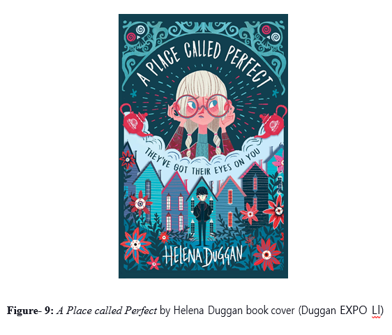
In the fantasy fiction novel A Place Called Perfect, published in 2017, the author Helena Duggan entails mysterious and fantastical incidents. This story revolves around the place named “Perfect” (Duggan 9), where everything is perfect except that, as anyone reaches the town, the person will go blind unless mysterious “rose-tinted” (Duggan 13) glasses are worn. Young protagonist Violet finds her father missing, and after encountering a stranger named Boy, they together discover more people have disappeared from the town. To unveil the secrets of Perfect, Violet, and Boy, set out on an adventure. The story is as gripping and fantastic as the book cover.
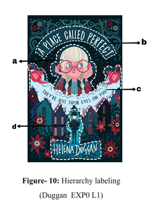
The hierarchy of placing the most important element first is outlined with white in the above image (see Figure 10), The levels of the hierarchy are arranged alphabetically, reducing the brightness of the secondary elements in the design. Violet and Boy, being the protagonists, are embedded on the front cover, and the houses around them are designed just as mentioned inside the book. The label a indicates the first attention that it seeks and is placed in the center, comparatively bigger than other objects, with dotted lines radiating from the character, and minimal objects around the white markings. Violet being the protagonist, and her puzzled expression with the “rose-tinted” (Duggan 13) glasses on brings the idea of suspense and question that the author wants the audience to grasp at first sight. The title of the book, label b with the book name in a bigger font size, is placed on the second level of the hierarchy over a plain background for a clear appearance. Label c justifies the next order that proves to display the subheading of the book, providing a bit more information about label a. In label c, “THEY’VE GOT THE EYES ON YOU” is placed on a plain background yet at a distinctly reduced font size to label b. Label c also holds its weight by the two teapots on either side of the cloud. Boy being the other protagonist, his strange initial appearance to Violet is used as a key to present here in label d. The author’s name comes into view as it is placed right beneath the darkest color jacket, Boy. The font is again maintained in upper case, but on the leaf pattern, which is unlike the pattern outside the label borders. This difference takes this hierarchy to the fourth layer of visualization. The house of the town, the greenery and flowers around, and the frame above label b fall into the latter stage of the hierarchy, where all it works that gels all elements. The author/ designer strongly aims to puzzle the viewer and generate attraction towards the plot rather than the other details. Hence, the hierarchy here clearly examines beautifying content as per its importance and communication message.
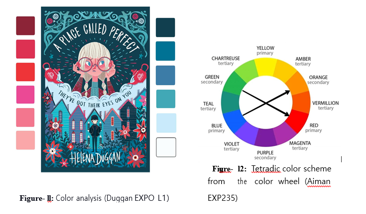
Color harmony is analyzed in figure- 11 by first listing the colors used in the design. As observed, the left scale has warm colors which fall under red and orange, and on the right side, cool colors blue and green are illustrated. As per the color segregation, red, orange, blue, and green colors in the color wheel (see figure- 12) signify the use of the Tetradic color scheme where double complementary (contrast/opposite) colors are used. With the original colors, their saturation and different values of each color are used. E.g. blue- light blue (tint) and dark blue (shade). Additionally, the use of cool colors here provides a pleasant and thought-provoking view that lets the viewers unfold to curiosity and stay agog towards the plot before reading it. The darkest color applied to the Boy, standing in the center with a poker face explains it as a strange character. “Hidden by dusk and the garden bushes” (Duggan 9) “Boy watched, statue still” (Duggan 10) depicts Boy’s behavioral aspects. Whereas, the warm colors here provoke energy and enthusiasm that pull the strength along the design. The portrayal of the Perfect town with attractive houses, greens, and flowers, yet a slice of unanswered questions through the character’s expression provides a push of energy.
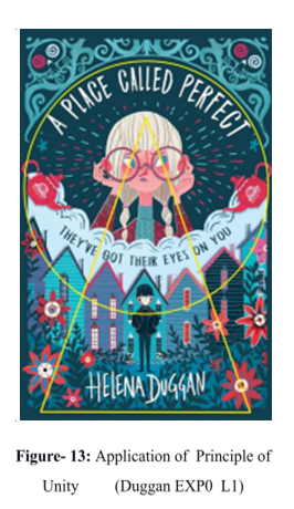
In fig- 13, the yellow shapes indicate the composition of the main elements and objects in the design. The golden point, i.e., the first center of attention, Violet with glasses placed in the center of the circle, holds the frame on top of it, including the book title, just as the curve of the circle flows down to the teapots, the cloud and it’s text and turns back to the top from the teapot on the right. Both the yellow outlined circle and triangle traced over the elements and objects in the design hold the composition in harmony with each other. The peak of the triangle, having the golden point, opens downward, collecting the other elements inside the triangle. The houses of the town grouped close to each other symbolize secrets kept within them and is placed as a background surrounding the character, Boy. “HELENA DUGGAN” is placed just beneath the Boy, holding a balance in content placement with the objects in the yellow circle. Despite multiple pieces of information and elements, the concept is offered on one plate with perfectly balanced nutrients and vitamins as per requirements
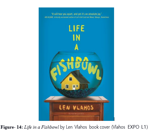
The Life in a Fishbowl by Len Vlahos, published in 2017, is a realistic fiction novel that refers to the events that could take place in real life. The plot revolves around a man, Jared Stone, diagnosed with terminal brain cancer. Being desperate to secure his family after his death, he signs a contract with a TV show producer with a five million-dollar offer in exchange for filming his last days of life. Everyone in the family is trapped in a reality TV show with their dying father and other sorts of media controversies. Therefore, the yellow-colored house (see Fig. 14) on the cover symbolizes family dynamite. Hence, placing the house inside a fishbowl with captivated freedom.
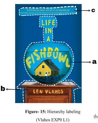
In Fig. 15, the fishbowl in the center consists of a yellow house, and the word “FISHBOWL” is named as label a. This label has the largest size, with a yellow color in the center. The unique idea of symbolizing the house as a family and a fishbowl as a captive for the family members gets its first attention. The word “FISHBOWL”, a part of the book title “LIFE IN A FISHBOWL” has an enlarged font and is placed one below the other, drawing attention to the yellow house. Label a is placed on the support of label b, where the fishbowl is placed over the brown-colored table to highlight the realistic human habit of placing the bowl on a steady table. The author’s name in yellow on the table has a bigger font size than “BLOOMSBURY” placed underneath, and label C is placed in the last, having a quote with a small font at the top. Len Vlahos symbolically represents the idea of the family collectively being trapped under the reality TV show, which restricts the family’s privacy and peace of mind. At the same time, they are publicly available to the world by broadcasting the everyday life inside the house; hence the open fishbowl is both trapped and freed at the same time. The background is left empty to restrict attention to more important elements than open space.
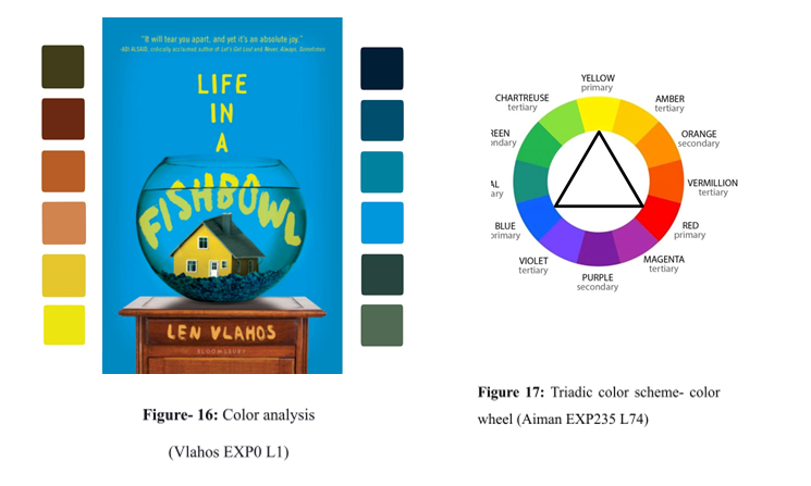
The book cover primarily consists of warm colors, and the right has cool color figures—16 are listed on both sides. A triadic color scheme is used where there are equal gaps between the colors selected from the color wheel (see figure 17). The basic colors used here are blue, yellow, and red. Tints and shades of these colors are used to establish color harmony. This scheme forms a triangle in the color wheel with the highest contrast and aims to present boldness, attractiveness, and power on the cover. The plain blue background is left empty with a single color with slightly low saturation from the borders to avoid disturbance in viewing the main elements, provides space to the other elements on the cover, and sets freedom. The blue color here represents calmness whereas the warm colors used here i.e., yellow and red, are mostly used for subjects and forms (actual three-dimensional objects). Here, only yellow and its tints and shades are used for all the fonts that lift the reading ability over the blue space. The house is also given a yellow color that balances with all these fonts. The tints and shades of red are used on the table, representing the power and strength that manage to hold the fishbowl. A dab of red is used for the house to maintain visual balance and harmony with the table. Vlahos bestows a book cover with an appealing color scheme that holds on to the elements used on the cover.
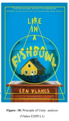
In figure 18, three yellow shapes are traced as per the composition of elements. The centermost circle holds the fishbowl in the center of the whole design with high contrast colors, the largest font size within, and the house grabbing its attention. The triangle’s peak is traced from the first three words of the book name, and the sides slide down over the word “FISHBOWL” passing over the table, covering the author’s and publisher’s names. In the last shape rectangle, the top side passing through the quote in parallel to the author’s name on its opposite side, as well as the left side of the rectangle and its opposite side passing through the blue plain background, balances all four sizes of the design. These elements in each shape placed in a symmetrical composition provide unity to the overall composition of the design.
The principles of design are successfully implemented on both the book covers studied under close analysis. Hence, the covers using principles of design, specifically the principles of hierarchy, color harmony, and unity, are more appealing to the audience. Though the author outsources publishing houses, designers, or the creative team to design the book cover, all work together to accomplish what unity desires to establish through the first look. The quantity of communication provided differs from different book covers. Thus, the use of these principles efficiently drives the designers to implement and manifest the book’s communication, i.e., the author’s thoughts. The book cover that distinctly conveys the theme, characters, setting, abstract idea or raises any notion prompts the reader to grab and read because the first impression is the best impression.
Bibliography
Aiman, Umme. “13 Important UX/ UI Terminology To Know for Every Designer”. Go Design. Accessed 11 May, 2022.
Black, Jill. “Color Psychology for E-Book Cover Design”. Scribd, uploaded by thunderdome, accessed on 9 May, 2022.
“Color System”. Colors and Materials. 16 September, 2014. Accessed 11 May, 2022.
“Design Principles: Hierarchy of Information.” Bridgewater Learning. 16 April, 2013. Accessed 7 May, 2022.
Duggan, Helena. A Place Called Perfect. Usborne. 1 August, 2017. Goodreads. Accessed May 11, 2022.
Regstad, Kjell. “The Principles of Design: Color Harmony.” WordPress.com, 27 May, 2015. Accessed 9 May, 2022.
Silveira, Dan. “What is the Unity Principle of Design?” Adobe, 14 January, 2021. Accessed 9 May, 2022.
“Understanding Visual Design Principles: Google UX Design Certificate.” YouTube, uploaded by Google Career Certificates, 6 June, 2021.
Vlahos, Len. Life in a Fishbowl. Boomsbury. 3 January, 2017. Goodreads. Accessed 14 May, 2022.
“Warm and Cool Colors: What They Are and How To Use Them”. Colors EXPlained. Accessed 11 May, 2022.
Regards,
Nikitha Srinivas Karnati
Visual Art Facilitator
Mumbai
My name is Nikitha Srinivas Karnati, and I am based in the vibrant city of Mumbai. Currently, I work as a Visual Art Facilitator at Mount Litera School International, where I have the incredible opportunity to nurture young minds through the power of art. As an educator, I thrive on exploring diverse techniques that unlock creativity, integrating real-life examples to ensure the learner’s experience is engaging and relevant. Embracing technology as a valuable tool, I constantly seek new perspectives to enrich my teaching methods. My wide-ranging interests in fine art, media, literature, and dance continually inspire me, allowing me to expand my horizons. As someone who believes in lifelong learning, I am always open to new approaches, viewing art not just as a skill but as an enriching experience. I constantly seek experience that allows us to connect with our inner selves and the beauty of the world.